“No, no, no! No one is going to read this. It’s too long!”
That’s my internal voice when I open most communications. Tiny scroll bars are my arch-nemesis – a sign that someone has not done a good job of editing.

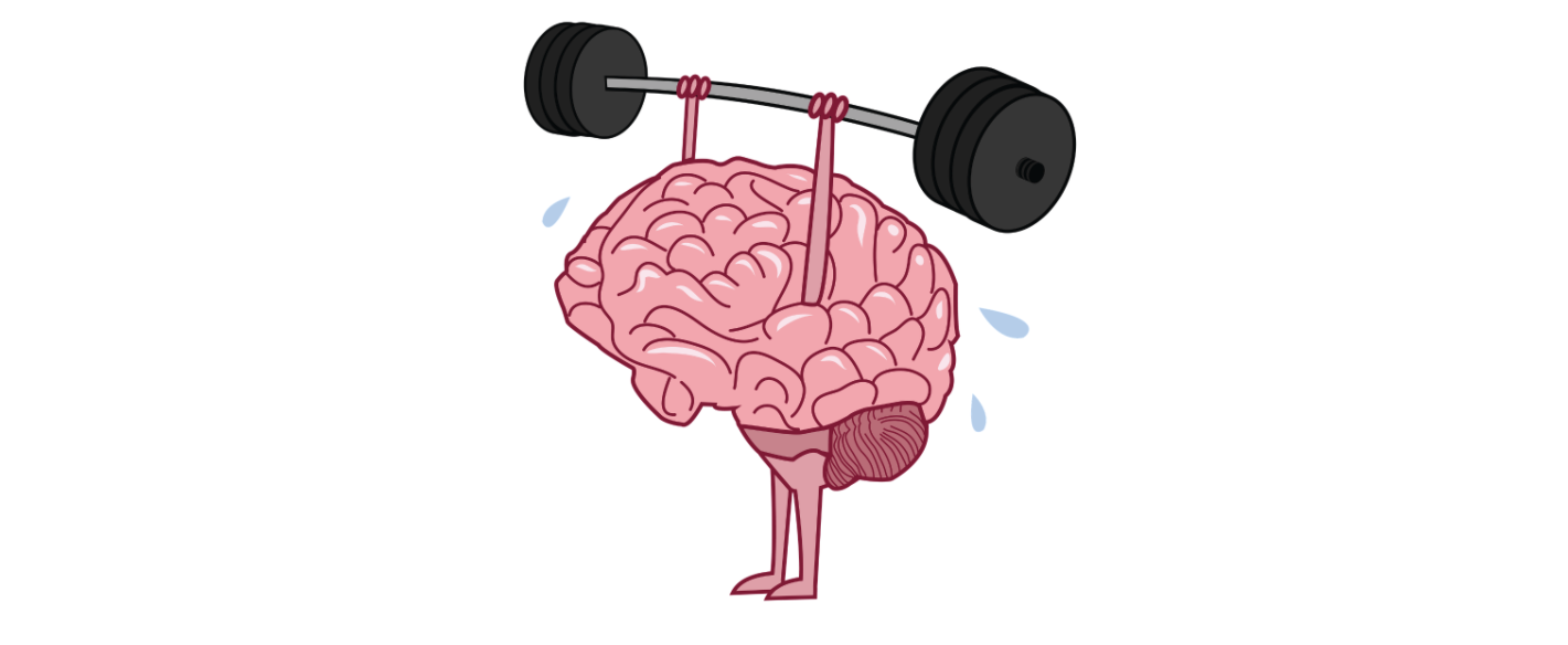
Any class on the brain will teach you that there are limits on our ability to process information. After about 7 (+/- 2) new pieces of data, we begin dropping new data. We need time to process it.
The older we get, the more keenly we are aware of these limits, so we just stop reading long notes. Younger people, trained by Twitter and TikTok tune out even faster.
The issue is not just with lengthy text. These elements also consume our limited reserve of information-processing power:
- Multiple fonts
- Different text sizes
- Multiple colours
- Graphics/images that do not complement the text
- Excessive use of CAPS, punctuation!!!!, bold and underline
Our brains are tuned to notice differences. We pay attention to the different fonts and wonder why they seem to be so random. The more novelty you have in your communications, the more we get distracted by the medium, and lose the message.
Simplify!
Stick to a small set of complementary colours. Ruthlessly edit out information that will not help the receiver take the action you are expecting. Get to the point quickly.
These are a few of my favorite tips that my clients appreciate:
- Put “ACTION” or “REVIEW” in the subject line so the reader knows what is expected
- Outline the call to action (CTA) in its own section – right at the top if the communication is lengthy
- Bold the critical points, because people will skim even a well-written note.
Because our ability to process information is limited, when a message is poorly formed, it generates frustration for the receiver, kills the credibility of the sender, and makes us less likely to bother paying attention to the next message. Maximize your impact – keep it simple!
Thoughtfully yours,
Jeff Skipper


