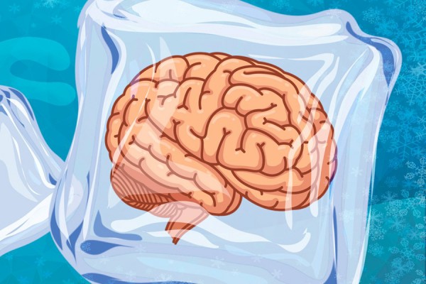
Who doesn’t like a cold treat? Shaved ice in Hawaii. Frigid smoothies from the juice shop. But great taste turn to great pain as the dreaded “brain freeze” sets in. Chilly sinuses get overloaded. We pinch the bridge of our nose to chase away the pain, but all we can really do is wait it out.
As much as I love change, my brain can get overloaded in the same way. Last week we moved houses. It took 17 hours. I was so tired the next day there were moments I could not string together a coherent sentence. I said to my wife regularly, “Don’t ask me to make any decisions.” I just didn’t have the capacity.
When you’ve been in a home for 20 years as we had, the environment does not present any new stimulus. We knew every inch of it. That left all of our energy available to focus on family, work, and hobbies. But this move forced hundreds of decisions, some of them with big consequences. Paint? Renovate? Where would you like these 50 boxes to go? Where should we install the security panel? Endless.
…which led me to points at which I could not form a complete sentence and avoidance of all decisions. Meal choices would have sent me over the edge.
We are attracted to everything new – shiny objects!! – until it becomes overwhelming. It’s fun to look at new stuff and think about things, but every shiny object comes with a cost. Each day we have only so much energy for processing information, making decisions, and navigating change. It all comes from one bucket that gets depleted through the day.
When we want people to focus on something important, like a major change, do not present it with ten colours, fifteen fonts, a lively soundtrack and and a new layout on every page. I have seen presentations like that! Our brains get distracted by all of the details and we miss the message. Great training and great presentations are very careful to select a limited palette and use repeating structures. It helps our brain acclimatize quickly and focus on the content.
Strike a balance. Make your message attractive but ensure everything aligns with the message. Attract attention, steer to the content, and reinforce the message with minimalist visual and auditory elements. KISS is still a great guideline: Keep It Simple Stupid.
Thoughtfully yours,
Jeff Skipper


