“Hi! This is my first time using the app and I have no idea what I’m doing. Can you please help me?”
That was my opening line to the first cast member I met at Disneyland yesterday. And, as expected, the response was immediate and SUPER positive: “Sure! Let me show you.” Click here, then there, then there again, then confirm, then double-confirm. So easy! (nope)
He was so helpful that when I arrived at the next attraction, guess what I did? “Hi! I have a reservation but no idea how to find it…” After a full day at Disneyland I learned very little about the app. I didn’t need to. There was help everywhere, delivered with a smile.
The app was good, but not intuitive. The staff walked me through what I needed, but there were too many steps to remember. With plentiful help available, it was easiest to remain personally helpless.
Instead of just providing support, how can you help people get smarter? How can you facilitate the transfer of learning to application? (and if possible, make the whole process simpler).
I clocked a few more observations…
Every bathroom smells fantastic!
This was the most memorable aspect of the day. OK, second most. But still, how often do you enter a public bathroom and it smells GOOD?? Never! And this was “Food and Wine” week at Disney!
The details matter, and when you nail something – even something basic – that no one else pays attention to, it stands out. It’s memorable. It makes for stories worth sharing (in newsletters).
What are easily overlooked everyday experiences that you can dress up so they stand out? Where can you extend a red carpet where there isn’t usually one? (Hint: Why not during onboarding?)
Align the little stuff
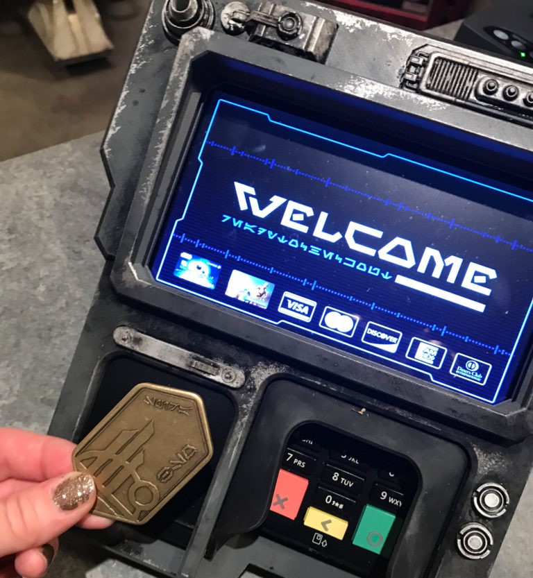
The main reason I went to Disneyland was to experience Galaxy’s Edge – the new Star Wars exhibit. They’ve embedded lore from the Star Wars universe everywhere. EVERYWHERE! Even down to the letter and design on the payment terminals. Check it out:

And in the rest of the park you can find hidden Mickey Ears everywhere. There’s always an interesting detail to look at.
For your project, how can you go beyond the usual posters and memos by dropping teasers in the most interesting places? (Hint: Try the kitchen, or embed clues in your virtual backdrop.)
The future is predictable?
It’s no surprise that the Disney app provides estimates of waiting times for all of it’s attractions. That’s helpful, but they missed a big opportunity.
Everyone using the Disney app is providing location data. That means Disney could easily show where the biggest crowds are, the fastest paths between destinations, and an estimate of the time it will take to get there. But that info is not available.
How can you make the path through change even more predictable for your stakeholders? What can they expect along the way, and what is the range of time it will take people to adapt?
In our increasingly busy lives, it’s harder to capture people’s attention. Transforming the commonplace (like bathrooms), aligning all of the details, making the future predictable, and helping them to not only learn but apply new skills will give our people the best chance of success.
Thoughtfully yours,
Jeff Skipper


